
The Cause & Effect (CE) diagram, also sometimes called the ‘fishbone’ diagram, is a tool for discovering all the possible causes for a particular effect. The effect being examined is normally some troublesome aspect of product or service quality, such as ‘a machined part not to specification’, ‘delivery times varying too widely’, ‘excessive number of bugs in software under development’, and so on, but the effect may also relate to internal processes such as ‘high rate of team failures’.
The major purpose of the CE Diagram is to act as a first step in problem solving by generating a comprehensive list of possible causes. It can lead to immediate identification of major causes and point to the potential remedial actions or, failing this, it may indicate the best potential areas for further exploration and analysis. At a minimum, preparing a CE Diagram will lead to greater understanding of the problem.
The CE Diagram was invented by Professor Kaoru Ishikawa of Tokyo University, a highly regarded Japanese expert in quality management. He first used it in 1943 to help explain to a group of engineers at Kawasaki Steel Works how a complex set of factors could be related to help understand a problem. CE Diagrams have since become a standard tool of analysis in Japan and in the West in conjunction with other analytical and problem-solving tools and techniques.
CE Diagrams are also often called Ishikawa Diagrams, after their inventor, or Fishbone Diagrams because the diagram itself can look like the skeleton of a fish.
Use it when you start investigating a problem
Construct a CE Diagram whenever you need to investigate the causes or contributing factors for an effect (be it a quality characteristic or other outcome) which is of concern to you. This will most likely be after you have conducted a general investigation of problems for a particular function, product, or service, and ranked them using a Pareto Chart. The effect ranked highest provides the starting point for a CE Diagram.
For example, you may just have completed an investigation of all the reasons recorded for goods being returned by customers and found that the highest incidence relates to incorrect goods being sent. A CE Diagram can be constructed to explore the possible causes for this.
Developing a CE Diagram in a team meeting is a very effective technique for,
- concentrating team members’ attention on a specific problem
- pooling, and reflecting back, team thinking
- constructing a picture of the problem at hand without resorting to the tight discipline of a flowchart
How to draw CE diagram
This is a three step process.
Step 1
Write down the effect to be investigated and draw the ‘backbone’ arrow to it. In the example shown below the effect is ‘Incorrect deliveries’.

Step 2
Identify all the broad areas of enquiry in which the causes of the effect being investigated may lie. For incorrect deliveries the diagram may then become:
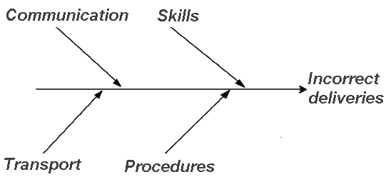
For manufacturing processes, the broad areas of enquiry which are most often used are Materials (raw materials), Equipment (machines and tools), Workers (methods of work), and Inspection (measuring method).
Step 3
This step requires the greatest amount of work and imagination because it requires you (or you and your team) to write in all the detailed possible causes in each of the broad areas of enquiry. Each cause identified should be fully explored for further more specific causes which, in turn, contribute to them.

You continue this process of branching off into more and more directions until every possible cause has been identified. The final result will represent a sort of a ‘mind dump’ of all the factors relating to the effect being explored and the relationships between them.
Different types of CE Diagram
There are three different types of CE Diagram. The basic type explained above is called the Dispersion analysis type. The other two are the Production process classification type and the Cause enumeration type.
Production classification type
This type differs from the basic type above in that each discrete stage in the production process leading up to the effect being examined is shown along the main arrow or ‘backbone’ of the diagram. Possible causes are then shown as branches off these.

This type of CE Diagram is often easier to construct and understand because those involved are already familiar with each of the production steps identified.
Cause enumeration type
This is not so much a different type of diagram but a different method of constructing a diagram. Instead of building up a chart gradually (starting with the ‘backbone’, deciding broad areas, then adding more and more branches), you postpone drawing the chart and simply list all the possible causes first. Then draw the chart in order to relate the causes to each other. This method has the advantage that the list of possible causes will be more comprehensive because the process has a more free-form nature. The disadvantage is that it is more difficult to draw the diagram from this list rather than from scratch.
This method of drawing a CE Diagram can be used in conjunction with Brainstorming by using it to distil the brainstorm output down into a logical and useable set of information.
What to do with the completed CE diagram
Most of the value of CE Diagrams lies in the process used to produce them. This process leads to ideas and insights into the problem which you would not otherwise have had, and which will give you leads for further investigation or for experimenting with possible solutions.
When developed by a team, the CE Diagram becomes a sort of ‘shared conceptual space’ in which the problem is examined in common by all team members with the results that,
- possibilities will be uncovered which would otherwise have remained hidden
- all team members will benefit from each other’s contribution and develop a common understanding of the problem
Since it takes some time to get to the heart of most problems, the CE Diagram can also be used as a working document which is changed as new data is collected and different solutions tried.
Good and bad CE diagrams
A good CE diagram is one which explores all possibilities so it is likely to be large and complex-looking as twig after twig sprouts for each new related idea noted down. Be suspicious of CE Diagrams with few factors, or which are neat and well ordered. These may reflect a lack of knowledge of the situation, or show that the effort to draw the diagram was not creative and exhaustive enough.
Other references
Kaoru Ishikawa, Guide to Quality Control, Asian Productivity Organisation, 1991